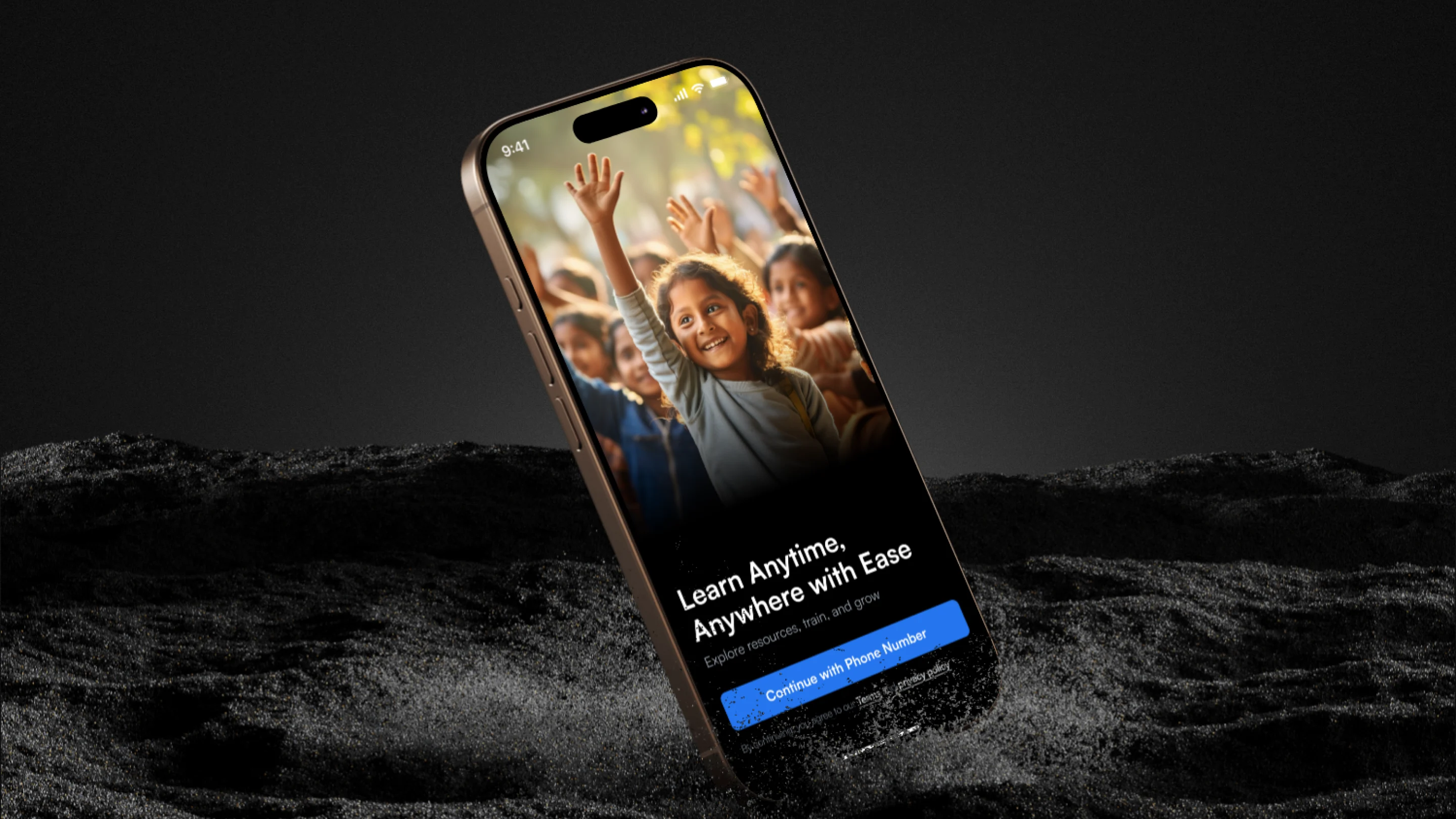
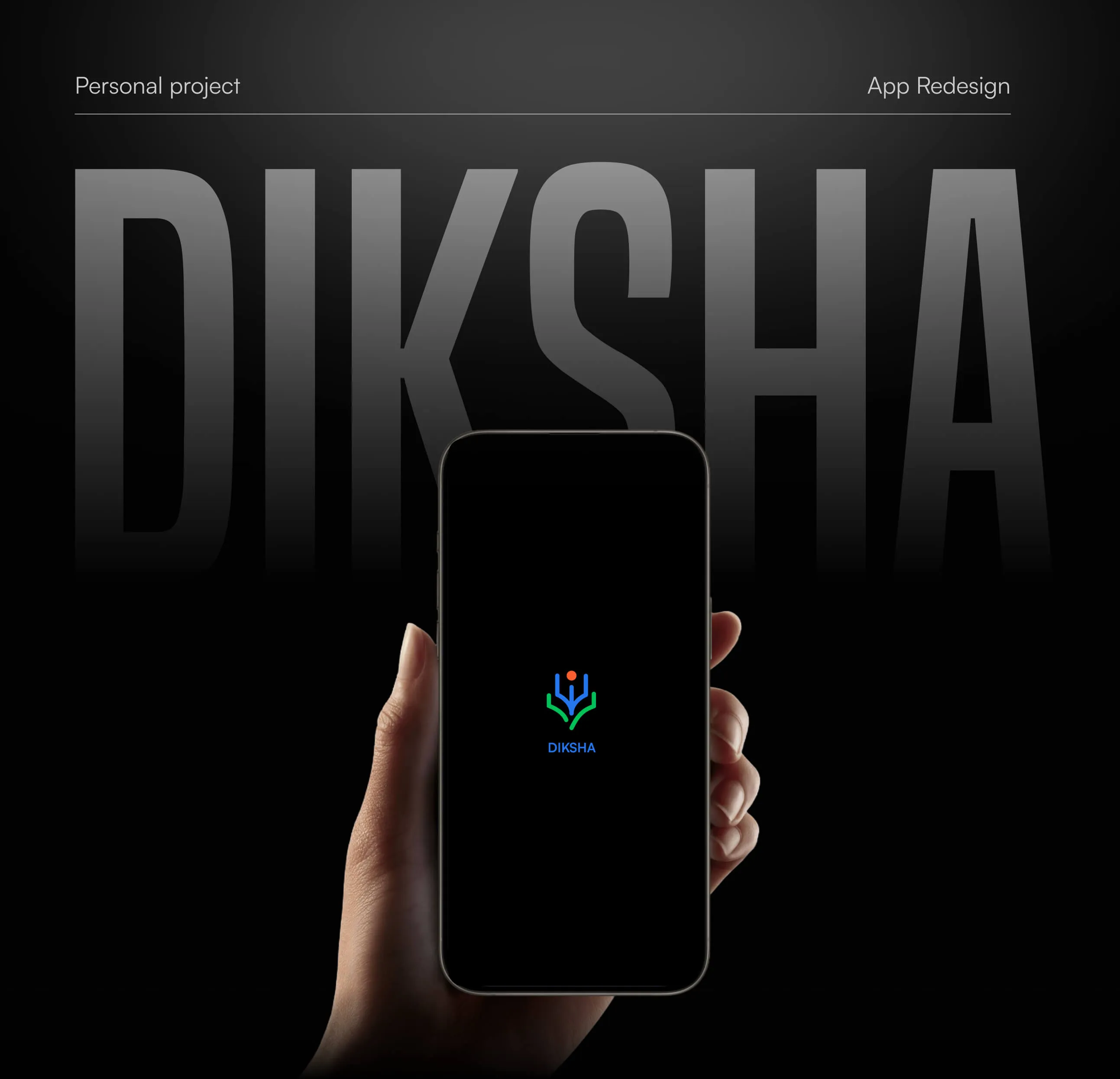
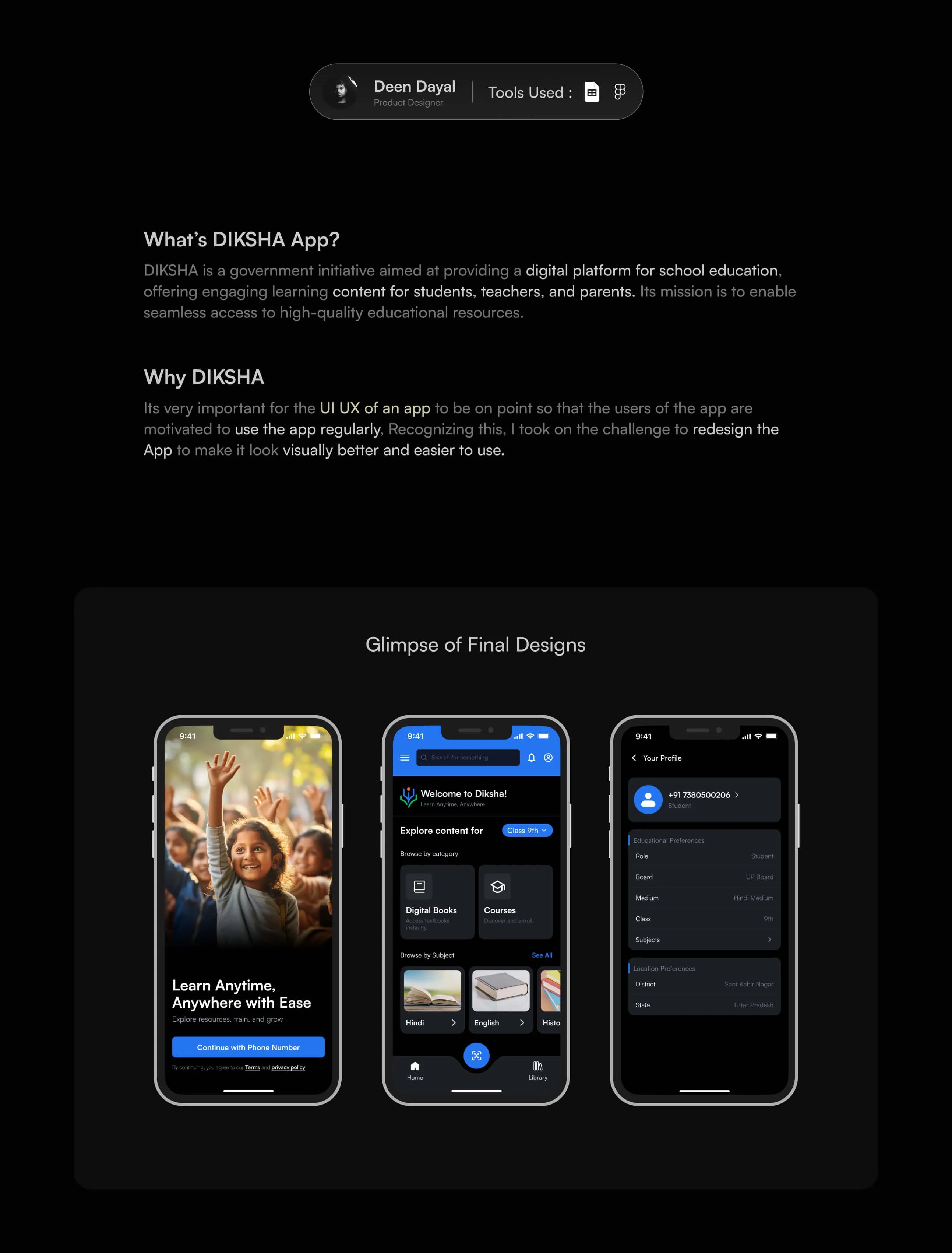
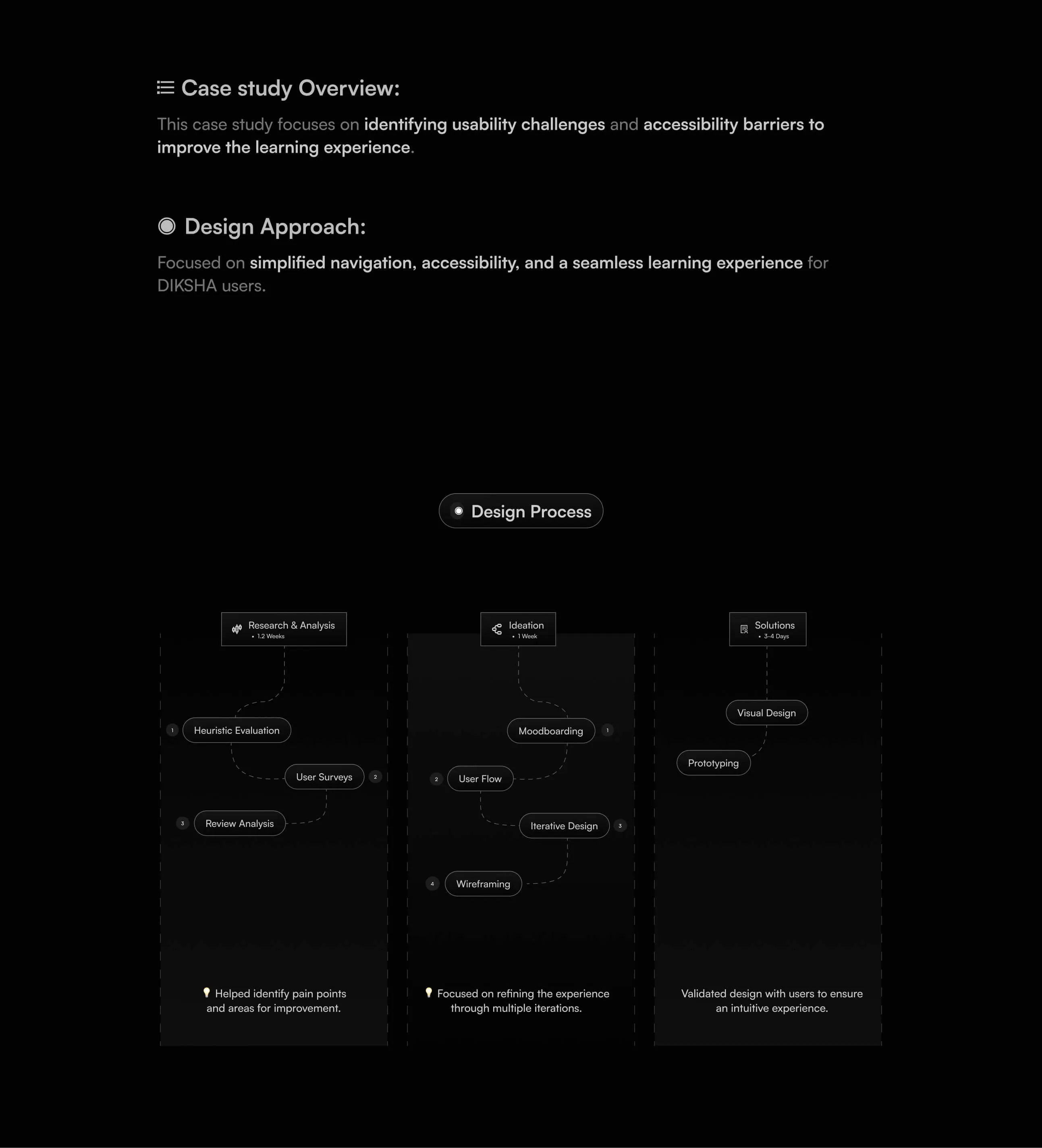
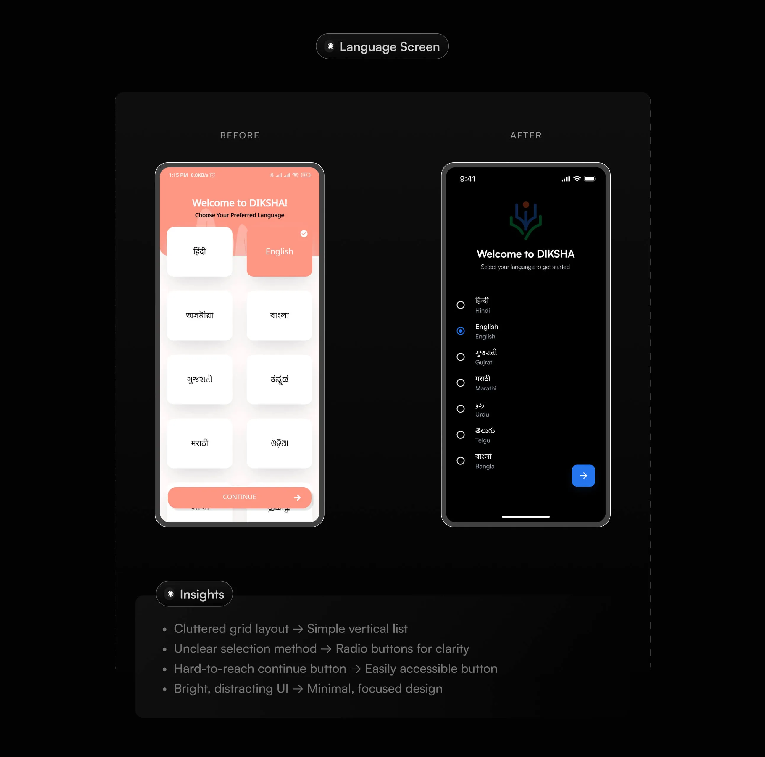
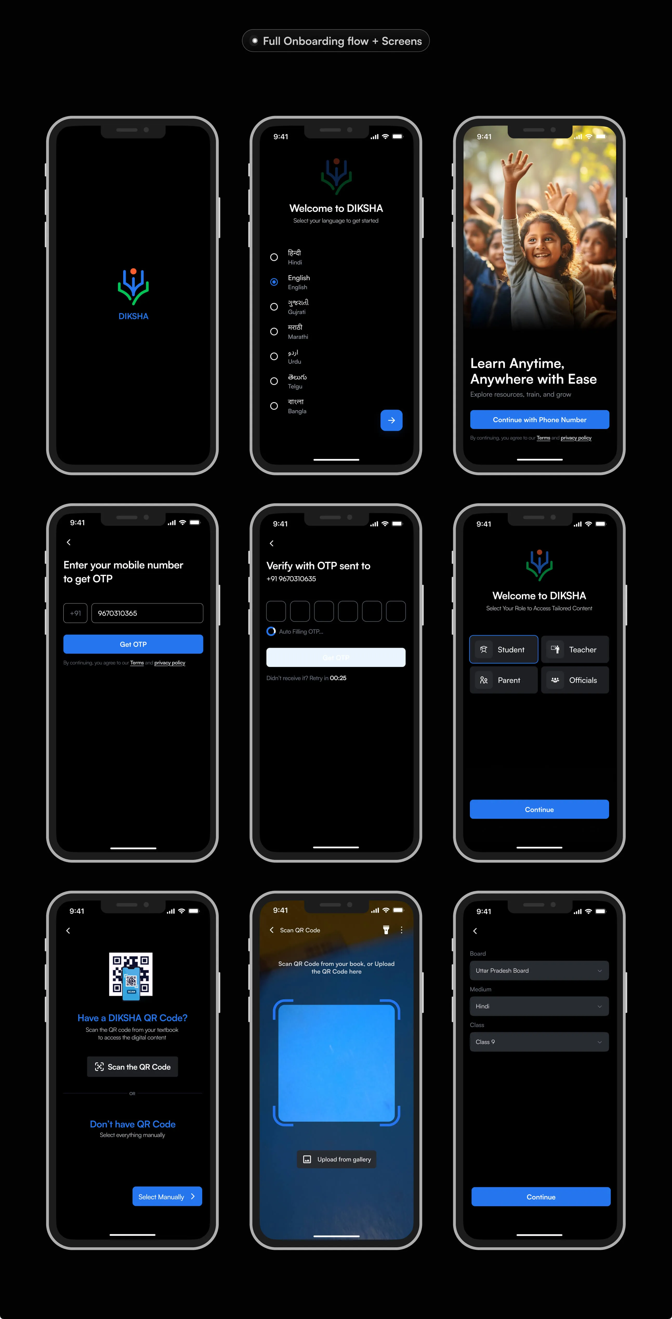
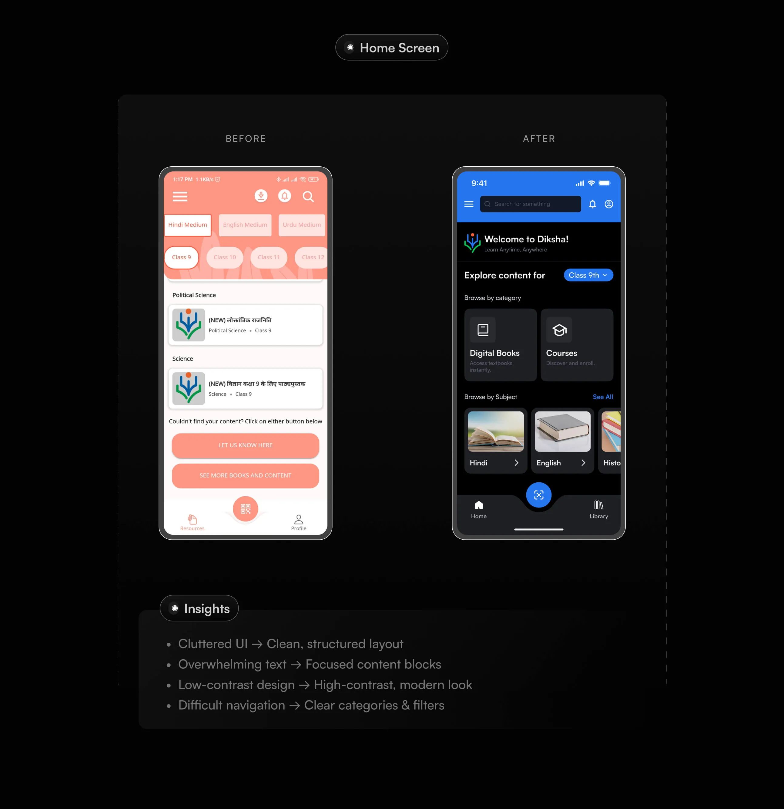
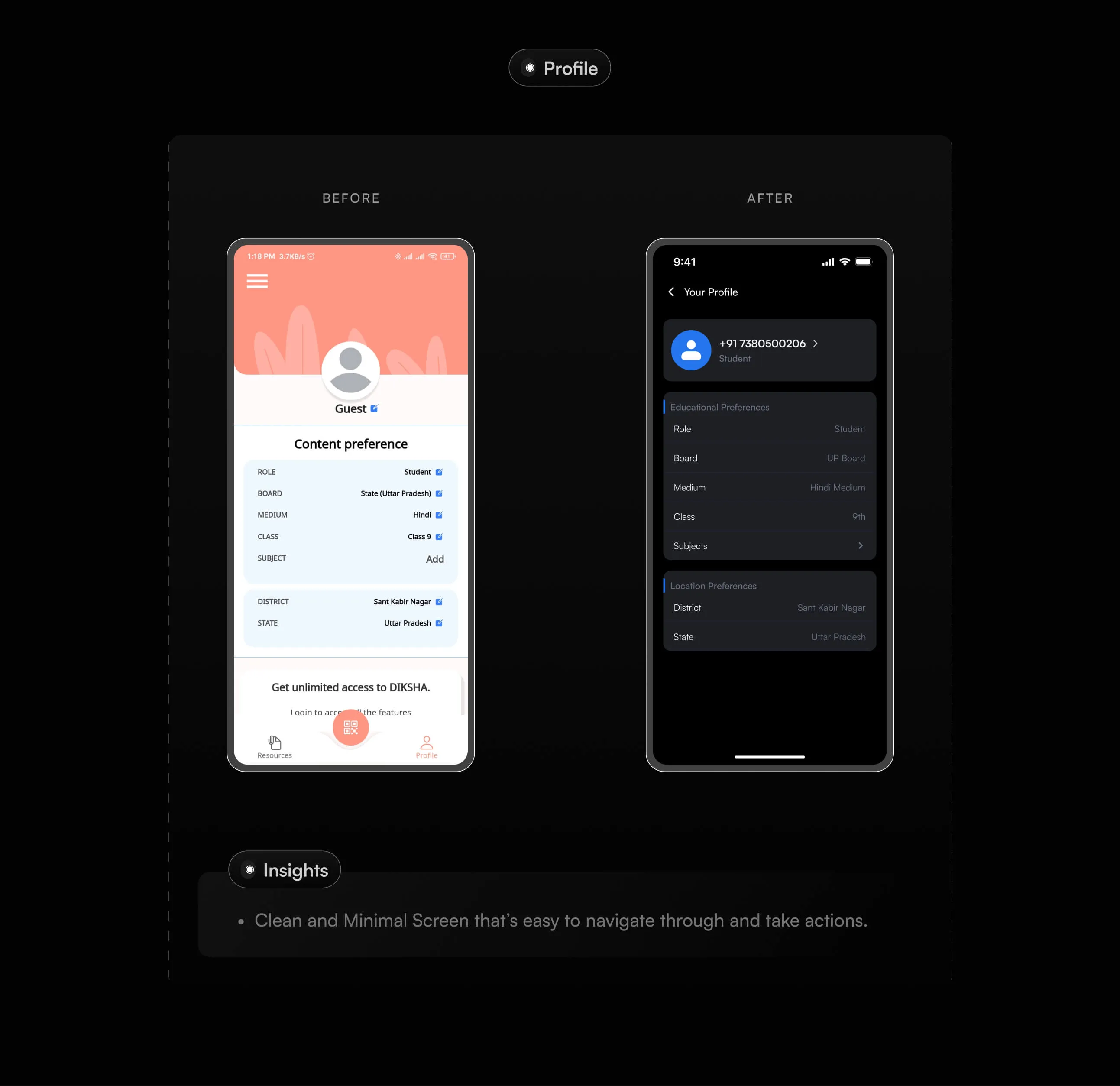
DIKSHA App — Redesigning a Government Learning Platform

A modern redesign of a government learning app to make education more accessible, engaging, and easy to use for students and teachers.

Role

Product Designer

Project Type

Mobile App

Timeline

3 Weeks

Tools

Figma, Chat GPT, Adobe Photoshop, Illustrator
Smartphone displaying an educational app screen with children raising their hands, showing text 'Learn Anytime, Anywhere with Ease' and a blue button labeled 'Continue with Phone Number.'
Hand holding a smartphone displaying the DIKSHA app logo on a black background with large text 'DIKSHA' behind it.Screenshot of DIKSHA app interface showing a welcome screen with a child raising hand, a content exploration screen with digital books and courses, and a profile screen with student educational preferences.Design process overview with three phases: Research & Analysis (heuristic evaluation, user surveys, review analysis), Ideation (moodboarding, user flow, iterative design, wireframing), and Solutions (visual design, prototyping), highlighting focus on usability and accessibility improvements for DIKSHA users.Screenshot showing six identical 3-star user reviews highlighting app faults, followed by insights noting cluttered information, no quality control, navigation struggles, forced landscape mode, and poor interface responsiveness.Style and typography section showing a color palette with labeled colors including Primary #2475EE, Surface #1D1F24 and #292A2F, Border #1F2937, Background #000000, Primary Text #FFFFFF, and Secondary Text #6B7280, followed by a font section specifying the font 'Satoshi'.Note stating that comparing each screen makes the case study longer, so only necessary screens are included.Side-by-side comparison of DIKSHA app splash screens: before with a white background, logo, pink decoration, and welcome text; after with a simpler black background and just the logo and DIKSHA text.Before and after comparison of DIKSHA app language selection screens, showing a cluttered grid layout on a light background before and a simple vertical list with radio buttons on a dark background after.Comparison of two mobile app screens showing role selection in DIKSHA app, before with cartoon icons on a light background and after with simplified buttons on a dark background.Side-by-side mobile screens showing a before-and-after redesign of a QR code scanner interface, from a text-heavy, peach-themed screen requesting camera permission to a clean, dark-themed screen with clear options to scan QR code or select manually.Nine smartphone screens showing DIKSHA app onboarding: loading screen, language selection, welcome with learning message, mobile number entry for OTP, OTP verification, role selection, QR code scanning prompt, QR code scanner, and education board, medium, and class selection.Comparison of a mobile app home screen before and after redesign showing improved organization and modern, high-contrast look.Side-by-side comparison of a mobile app menu before and after redesign, showing a simpler, dark-themed menu with fewer options.Side-by-side comparison of a mobile app profile screen before and after redesign, showing a cleaner, darker interface with organized educational and location preferences.A note stating the intention to present a case study visually and inviting further discussion via email for a detailed presentation.Text on black background: 'Thanks for scrolling', '25,000+ Pixels', and contact email ux.dayal@gmail.com.